27 agosto, 2026 | by Edwin Mendivil Barceló
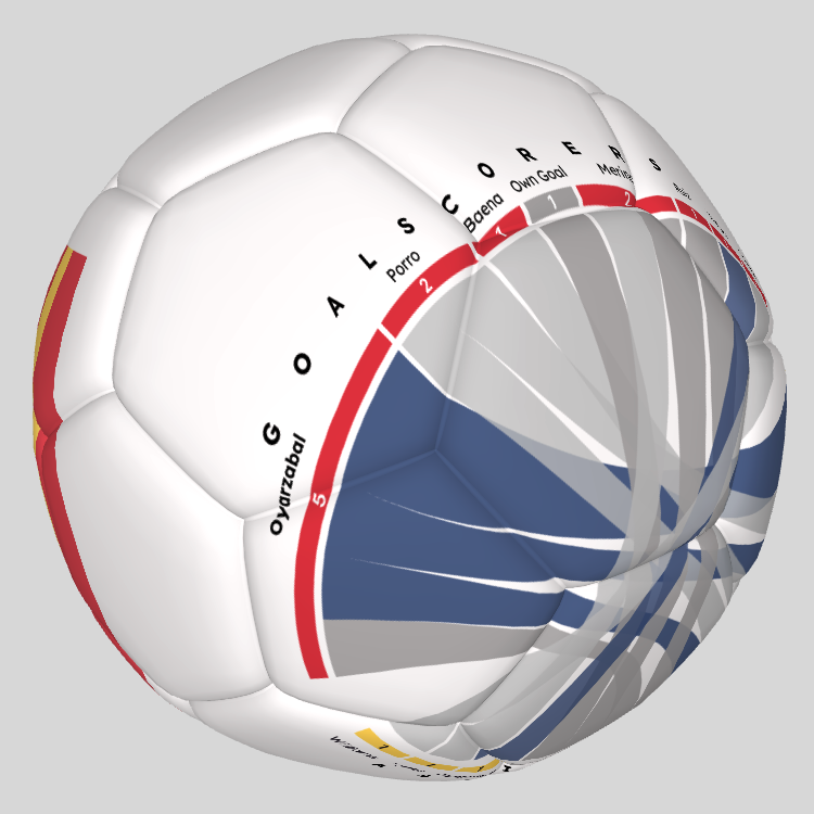
A Data Visualization using “Scrollytelling,” in which assists and goals by Spain team at the 2026 Football World Cup are displayed using a Chord Diagram on a 3D Soccer Ball. It is also a Design Concept for a Soccer Ball that incorporates a graphic.
TYPE: Scrollytelling | TOOLS: R, Figma, Blender, Javascript (P5.js, GSAP) | LINK: Goals & Assits: Spain WC | CLIENT: Personal | YEAR: 2026
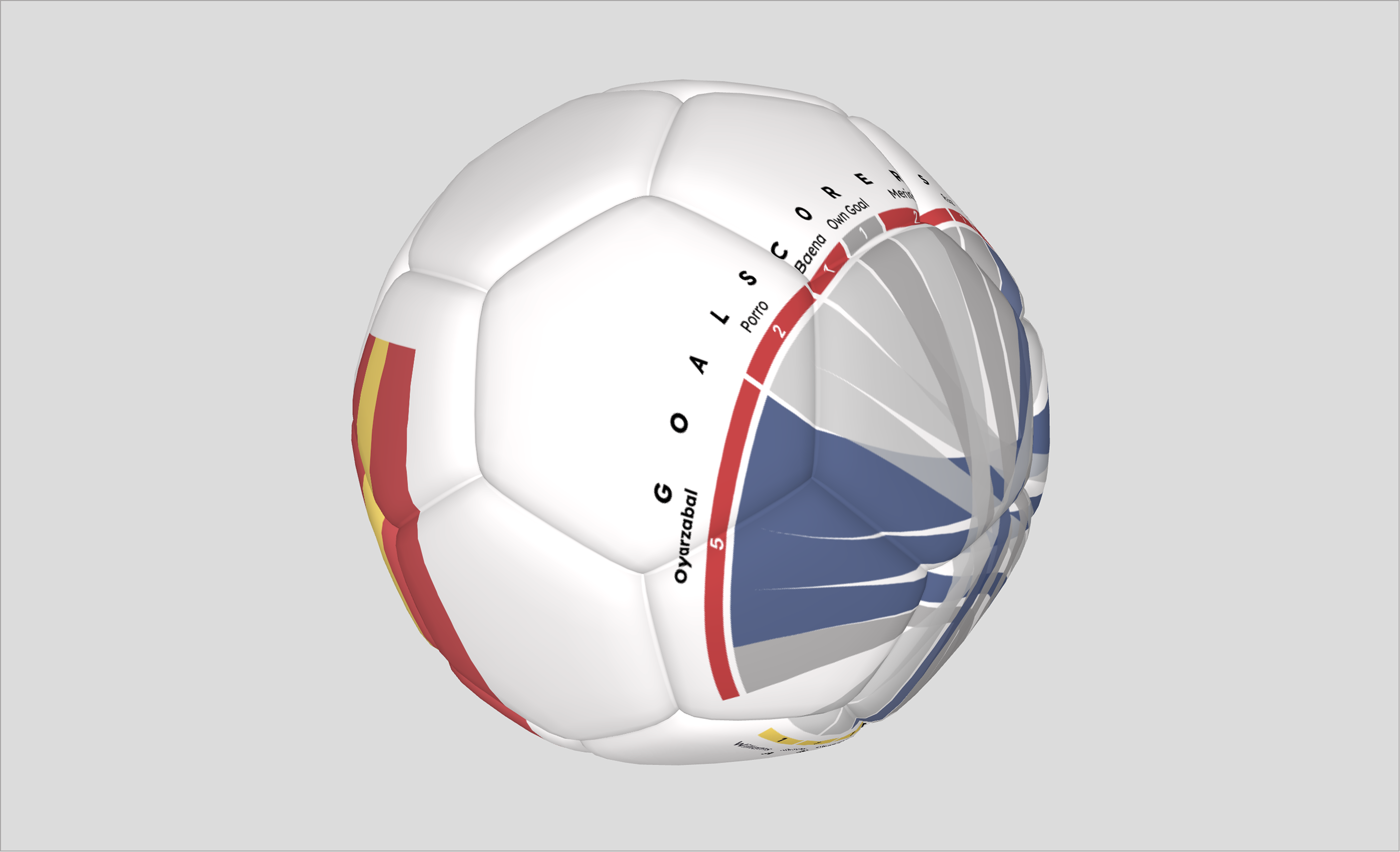
“Goals and Assists: Spain at the 2026 World Cup“ is a project that uses a Chord Diagram in a 3D Soccer Ball to display in a single visual which players assisted the scorers through Scrollytelling.
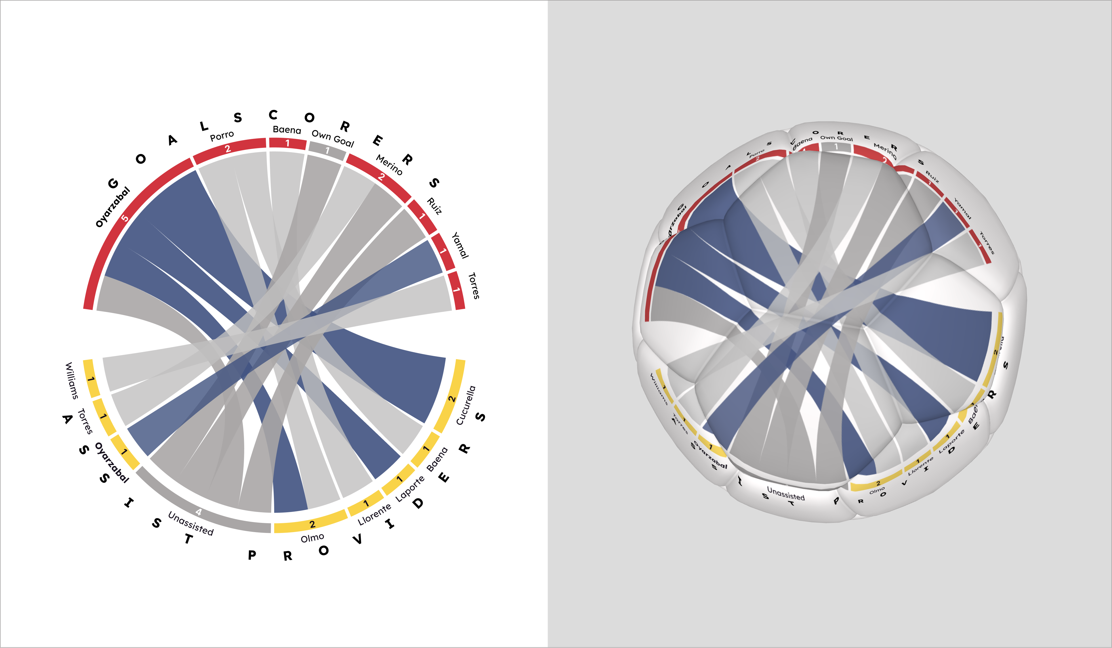
The Chord Diagram displays two categorical variables: the scorers at the top and the assist providers at the bottom. The arcs connecting the two categories indicate which player assisted a specific player; the thickness of each arc represents the number of assists for each pair: assist provider→goalscorer.
This is a chart that can be used more often in the Football Analytics field, as it displays assists and goals in a single visualization. If the number of subcategories (in this case, the players) is small and a limited color palette is used, this chart helps visually identify the distribution of assists, that is, were the assists distributed almost evenly or is one player the top assist provider?. Also, it also makes it possible to identify those lethal player pairings: the one that assists and the one that scores.
The football world cup party had started. I wanted to create a data visualization project that would be a little outside of the box, something that combined: football analytics, storytelling and a “wow” factor that would set the project apart. So I thought, if it is a circular chart and the theme is football, rendering it as a 3D model, specifically, a soccer ball, would be the project’s unique selling point.
In addition to representing the data, the curvature of the arcs of the diagram become the basis for the design of a soccer ball that makes it eye-catching and “chévere”, as they would say back home.
This concept could be described as a DataViz Product: a digital or physical object whose design changes partially or completely according to the data. Imagine the version for the other semifinalists: France, England and Argentina. The same chart, different colors, different soccer balls.
From the outset, I wanted to bring this project to life using the “scrollytelling” technique, in which, as the user scrolls down, each section of the story appears, the graphic updates, and text appears to explain or support what is shown in the speech bubble.
It wasn’t enough to simply display the diagram on a 3D model, I wanted it to feel interactive and dynamic, so that the user would have some control over what they were seeing.
The Chord diagram itself is an unconventional, little-known graph that is, in some ways, not so easy to understand, therefore, I needed to explain it step by step to help the audience understand it. It also serves as the central thread of the story, basically like this:
The [←→] horizontal , [↑↓] vertical, and [↖︎↘︎] diagonal rotations of the ball are intentional, designed to draw the user’s attention to a specific part of the diagram.
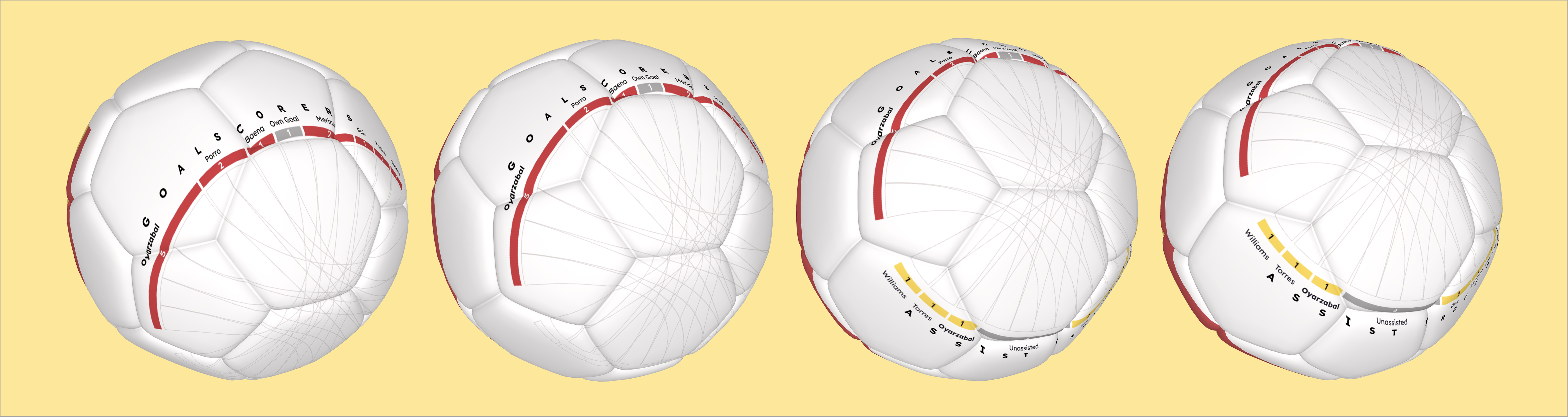
In addition, I applied one of the best practices in data storytelling or data visualization, which is to use the pre-attentive attributes. In each scene I highlight the part of the graphic I want the reader to see and I dim the rest of the elements so they don’t compete for the user’s attention.
The color palette matches the colors used by the Spain Team. The colors of the headings for each section: Red for Goals, Yellow for Assists, Grey and Blue for the Passes, match those of the soccer ball; the background also helps to reinforce what the reader is seeing: goals, assists and passes.
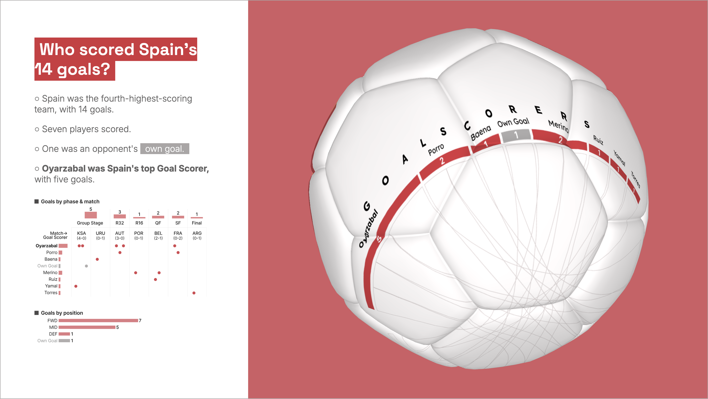
Finally, I wanted to add a little bit of fun to the story, and I achieved this through the typography I used and the animations in the titles of each section, as well as a specific image: the look of Cucurella :).

Edwin Mendivil Barceló
@vizualdatos

Convierto información compleja en historias visuales interactivas a través del análisis de datos, el diseño y la programación.
Power BI | Tableau | Rstats | Javascript
Dashboards Efectivos | Scrollytelling | Arte Con Datos